Choosing fonts for your brand: the two-font rule
Fonts do more for how your business feels than almost any other choice. A simple rule for picking them, and the mistakes I see most.
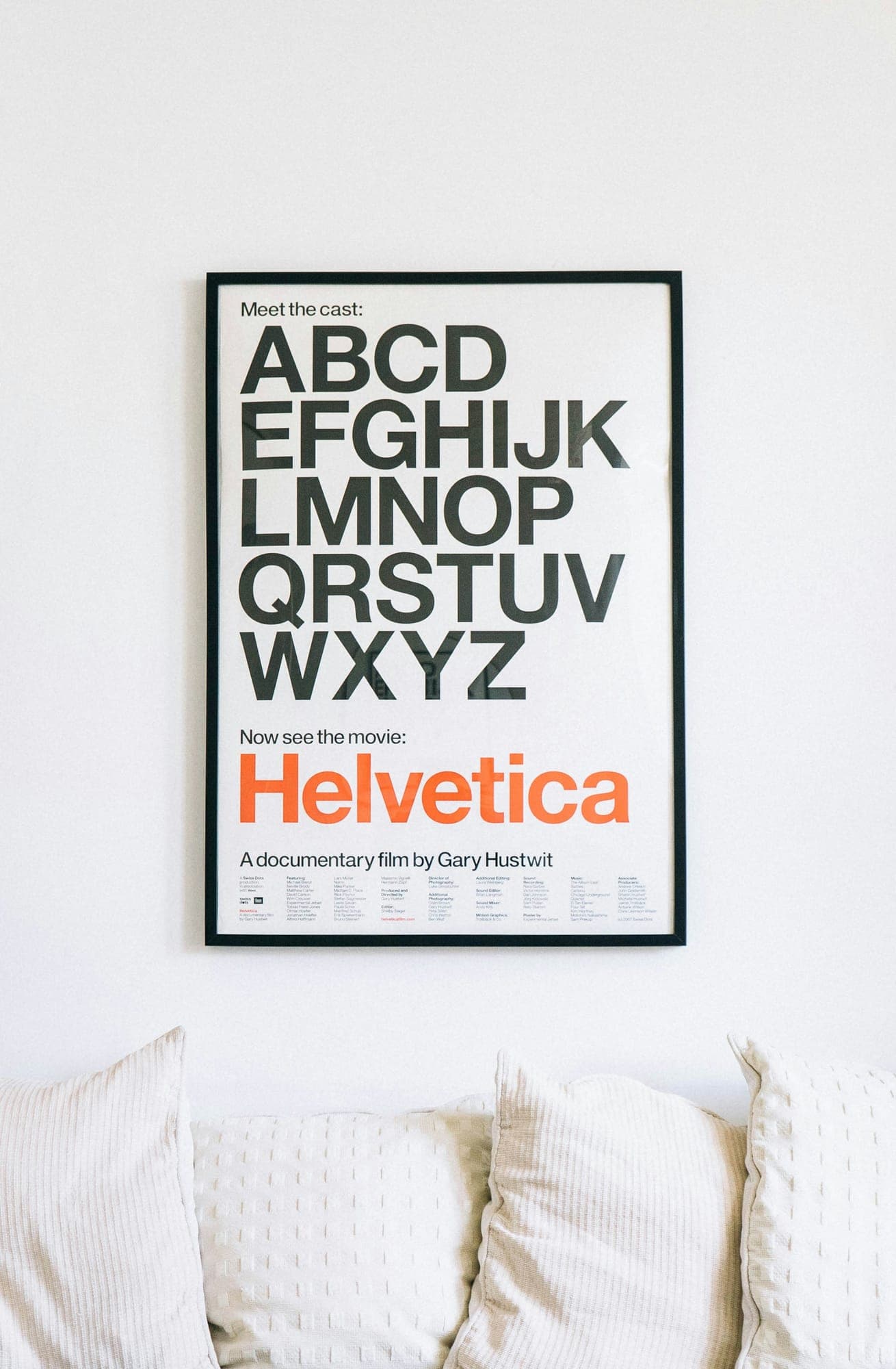
Change the font on a menu and the same dishes feel cheaper or fancier. Type sets the tone before anyone reads a word, which is why it is one of the first things I decide on a brand or website.
The two-font rule
Most brands need two fonts at most: one with character for headlines, and one quiet, readable font for everything else. Many great brands use just one, in a few weights.
- Headlines can have personality: a warm serif for a bakery, a strong grotesk for an electrician.
- Body text has one job: be easy to read at small sizes, on any screen.
Mistakes I see most
- Three or four fonts on one page, so nothing feels related.
- A decorative font used for paragraphs, which nobody finishes reading.
- Light, thin weights for body text that disappear on phones.
- Fonts without a web licence, which cannot legally go on the website.
Where to find good fonts
Google Fonts has hundreds of free, well-made fonts with web licences included. Paid foundries offer more distinctive options if your brand needs to stand apart. Either way, check the licence covers print, web and apps.
Every brand identity I design comes with a type pairing and a one-page guide on how to use it.