What every homepage needs
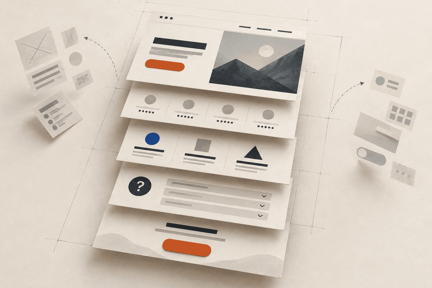
Most homepages try to say everything and end up saying nothing. Here are the five parts I put on nearly every homepage, in order.
A visitor decides in a few seconds whether your site is for them. They are not reading; they are scanning for three answers: what is this, is it for me, and what do I do next. A good homepage answers all three before anyone scrolls.
After years of designing websites, this is the structure I start from.
1. A headline that says what you do
Not a slogan. “Fresh bread since 1987” is nice, but “Bakery and café in Northfield, open from 7am” gets people through the door. Put the clever line underneath if you love it.
2. One main button
Book a table, get a quote, call now. Pick the single action that matters most and make it the only orange button on the screen. A second, quieter link is fine. Five equal buttons are not.
3. Proof, early
A short review, a recognisable client, a photo of your real team. Proof works best right after the headline, when the visitor is deciding whether to trust you, not at the bottom of the page.
4. The questions people actually ask
Prices, opening hours, where to park, whether you take their insurance. Whatever customers ask on the phone belongs on the homepage, in plain words. Every answered question is one less reason to leave.
5. The button again
End with the same action you started with. People who read to the bottom are your most interested visitors; do not make them scroll back up to act.
What to leave out
- Sliders that rotate before anyone can read them
- A “welcome to our website” paragraph
- Every service in equal detail. Link to a services page instead.
Want me to apply this to your business? Start a website brief and you will see the first design the next day.