Design for the phone first
Most of your visitors arrive on a phone, yet most websites are still designed on a big screen and squeezed down. Here is why I start small.
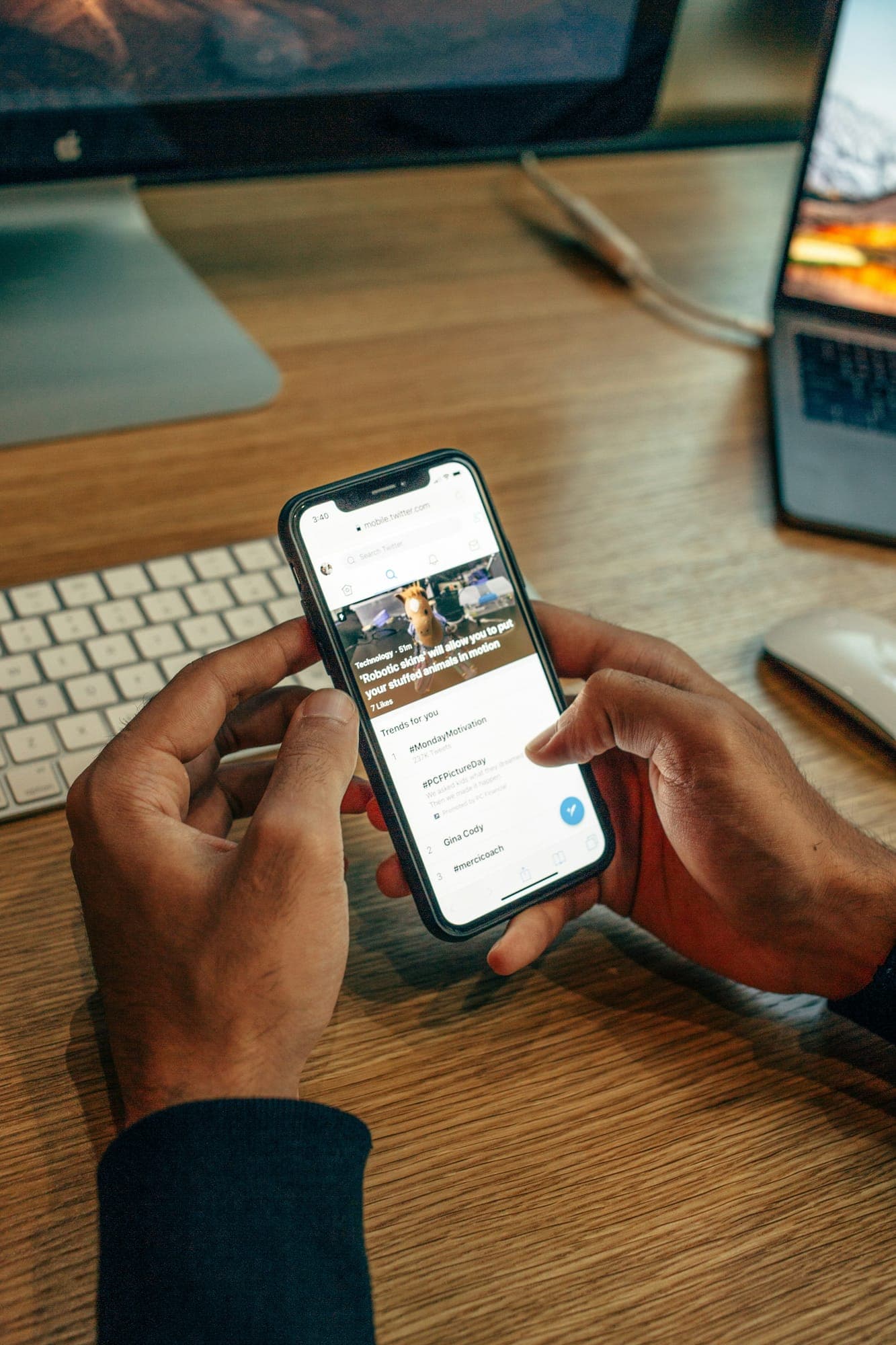
Look at the analytics of almost any website and you will find the same thing: most visits come from phones. People look you up in the car park, on the sofa, on the bus.
Yet many sites are still designed on a 27-inch monitor and then shrunk. The result is tiny text, buttons too close together and menus that need two hands.
Starting small changes the decisions
A phone screen has room for one idea at a time. Designing for it first forces the important questions early: what is the one thing this page must say, and what is the one button that matters?
Once that works on a phone, the desktop version is easy. You add space, not content.
What I check on every phone layout
- The main button is visible without scrolling
- Text is at least 16 pixels, so nobody needs to zoom
- Tap targets are big enough for a thumb, with space between them
- Phone numbers and addresses are tappable
- Forms use the right keyboard: numbers for phones, email for emails
If it works for a thumb on a bus, it will work for a mouse on a desk.
Test on a real phone
Browser tools that imitate a phone are useful, but nothing replaces holding the real thing. I review every site on an actual phone before you see it, and again before launch.