Why your logo needs to work at 16 pixels
Your logo is seen far more often as a tiny icon than on a sign. Designing for the smallest size first leads to better logos at every size.
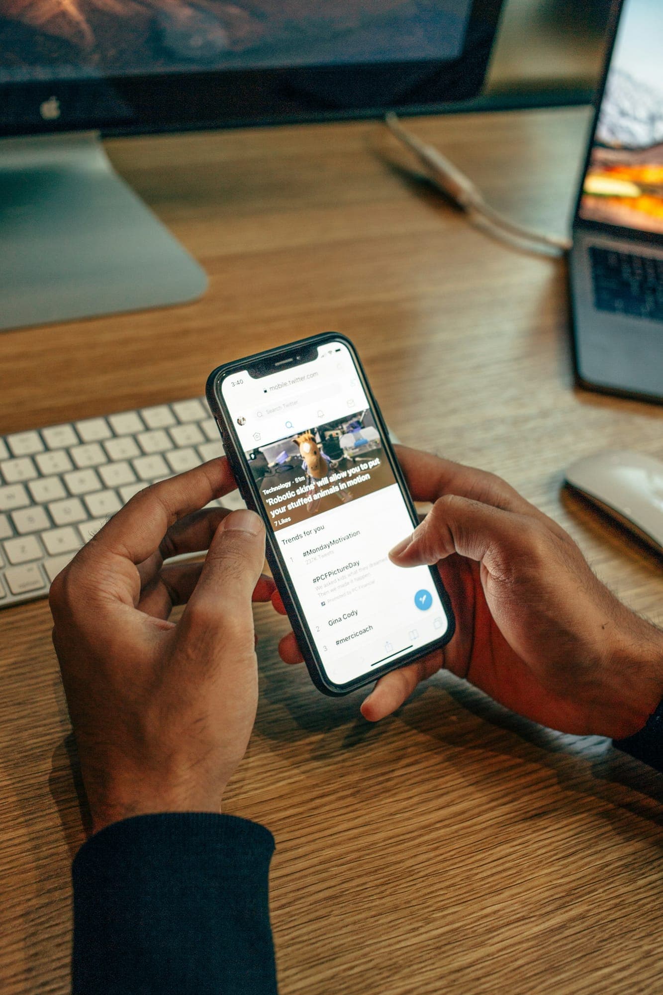
Picture where people actually see your logo. A browser tab. A profile picture in a crowded feed. The corner of a delivery app. A favicon in a bookmarks bar. Most of those are smaller than your fingernail.
A logo that only works large is a logo that fails most of the time. So I design for 16 pixels first.
What happens at 16 pixels
At favicon size you have 256 pixels in total. Fine lines disappear. Small gaps fill in. Three-word names turn into a grey smudge. Gradients become mud. Anything that relies on detail stops existing.
What survives is shape, contrast and one idea. That is also exactly what makes a logo memorable at any size.
How I test it
- I export every direction at 16, 32 and 64 pixels before presenting it.
- I place it in a mock browser tab next to real sites, not on a white page.
- I check it on a dark and a light background, in color and in one color.
- If it needs squinting to read, it goes back to the drawing board.
A mark and a wordmark
Most good identities have two parts: a wordmark for places with room, and a compact mark for places without. The MXMPixels logo works this way. The full chip reads “MXM Pixels”; the app icon keeps only an M and the orange square.
The small version is not an afterthought. It is often the version people recognise first, because they see it every day on their phone.
Design the logo for the worst place it will ever appear. Every other place gets easier.
Every logo project I deliver includes small-size tests and a separate icon version, ready for your favicon, app and social profiles.